Types of Graphs
The first type of graph that we will present is the line graph or line chart. A line graph displays data as a series of interconnected points on two axes (x and y), usually Cartesian, ordered commonly by the x-axis. Line charts are useful for demonstrating trends in data, such as in time series, for example.
A graph related to the line graph is the scatter plot. A scatter plot represents the data as points in Cartesian coordinates. Usually, two variables are demonstrated in this graph, although more information can be conveyed if the data is color-coded or size-coded by category, for example. Scatter plots are useful for showing the relationship and possible correlation between variables.
Histograms are useful for representing the distribution of data. Unlike the two previous examples, histograms show only one variable, usually on the x-axis, while the y-axis shows the frequency of occurrence of the data. The process of creating a histogram is a bit more involved than the line graph and the scatter plot, so we will explain them in a bit more detail.
Boxplots can also be used for representing frequency distributions, but it can help to compare groups of data using some statistical measurements, such as mean, median, and standard deviation. Boxplots are used to visualize the data distribution and outliers.
Each graph type has its applications and choosing the right type is paramount in the success of an analysis. For example, line graphs could be used to show trends in economic growth in the last century, while a boxplot for that would be hard to create. Another common data analysis task identifies correlations between variables: understanding whether two variables show related behaviors. A scatter plot is the tool commonly used to visualize this. Histograms are useful for visualizing data point numbers in a bin or a range, such as the number of cars whose efficiency is between 10 and 20 miles per gallon.
Line Graphs
Line graphs, as described in the previous section, connect the data points with a line. Line graphs are useful for demonstrating tendencies and trends. More than one line can be used on the same graph, for a comparison between the behavior of each line, although care must be taken so that the units on the graph are the same. They can also demonstrate the relationship between an independent and a dependent variable. A common case for this is time series.
Time Series Plots
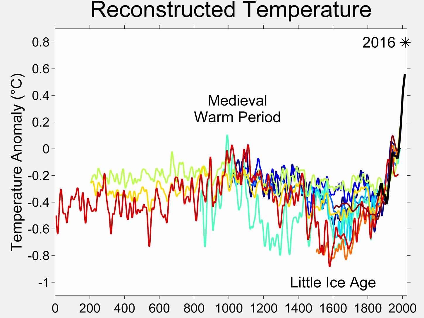
Time series plots, as the name suggests, graphs the behavior of the data with respect to time. Time series graphs are used frequently in financial areas and environmental sciences. For instance, a historical series of temperature anomalies are shown in the following graph:

Figure 2.6: Time series plot
Source
https://upload.wikimedia.org/wikipedia/commons/c/c1/2000_Year_Temperature_Comparison.png
Usually, a time series graph has the time variable on the x-axis.
Exercise 11: Creating Line Graphs Using Different Libraries
Let's compare the creation process between Matplotlib, Pandas, and Seaborn. We will create a Pandas DataFrame with random values and plot it using various methods:
- Create a dataset with random values:
import numpy as np
X = np.arange(0,100)
Y = np.random.randint(0,200, size=X.shape[0])
- Plot the data using the Matplotlib Pyplot interface:
%matplotlib inline
import matplotlib.pyplot as plt
plt.plot(X, Y)
- Now, let's create a Pandas DataFrame with the created values:
import pandas as pd
df = pd.DataFrame({'x':X, 'y_col':Y})
- Plot it using the Pyplot interface, but with the data argument:
plt.plot('x', 'y_col', data=df)
The output is as follows:

Figure 2.7: Line graphs using different libraries
- With the same DataFrame, we can also plot directly from the Pandas DataFrame:
df.plot('x', 'y_col')
The output is as follows:

Figure 2.8: Line graphs from the pandas DataFrame
- What about Seaborn? Let's create the same line plot with Seaborn:
import seaborn as sns
sns.lineplot(X, Y)
sns.lineplot('x', 'y_col', data=df)
The output is as follows:

Figure 2.9: Line graphs from the Seaborn DataFrame
We can see that, in this case, the interface used by Matplotlib and Seaborn is quite similar.